- Client
- Fashion Brand
- Industry
- Luxury E-commerce
- Services
- UI/UX · Mobile App · Brand
- Tools
- Figma
- Timeline
- 3 Weeks
- Year
- 2026
Overview
About the Project
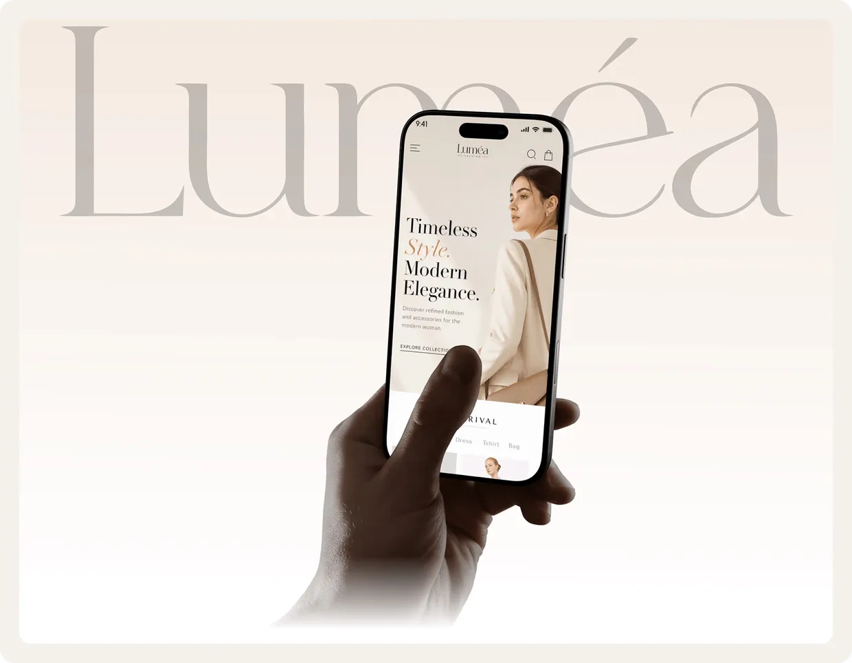
Luméa is a luxury fashion e-commerce mobile app designed to deliver a seamless, elegant shopping experience. Through minimal layouts, refined typography, curated collections, intuitive browsing, and a smooth checkout flow, it's crafted for modern fashion lovers.
The Challenge
Making Luxury Feel Effortless
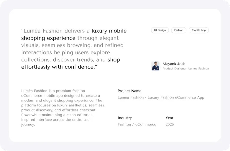
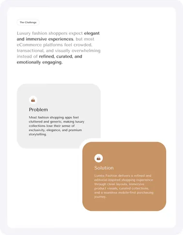
Luxury fashion shoppers expect an experience as refined as the products themselves. Generic e-commerce patterns feel cluttered and cheap. The challenge: design an interface minimal enough to let the clothing breathe, yet rich enough to guide browsing to a confident checkout.
Brand Identity
Refined by Design
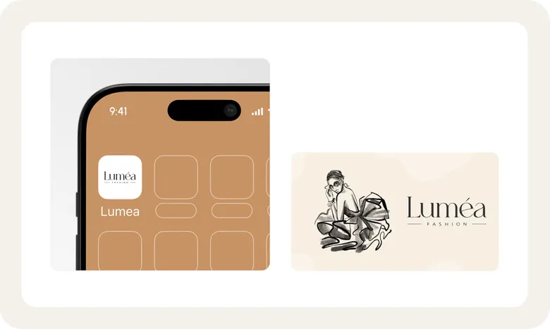
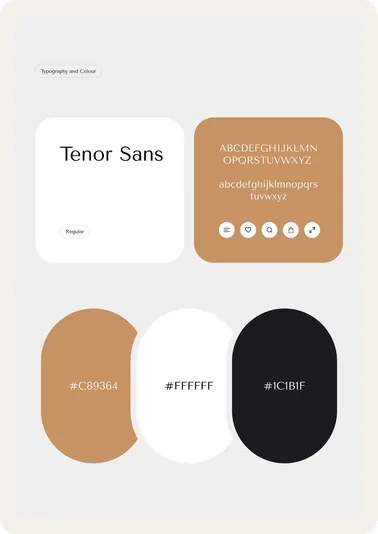
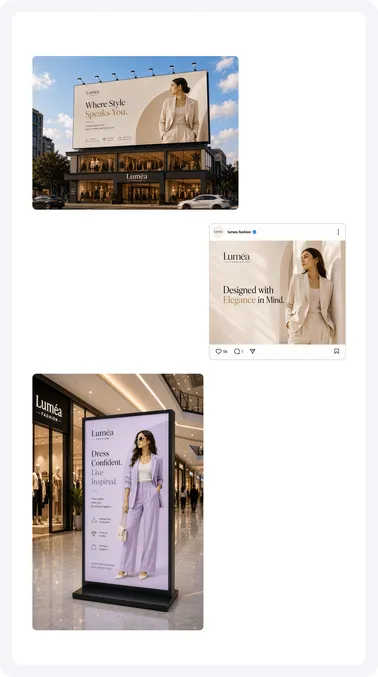
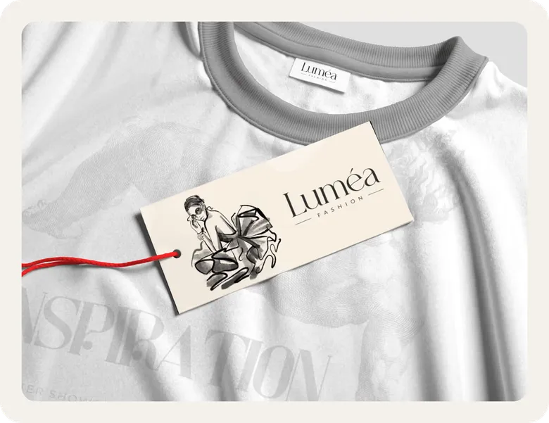
A restrained visual language: elegant serif typography, a soft neutral palette, and generous whitespace. Every choice signals quality and calm, the opposite of the loud, discount-driven look that defines most shopping apps.
The App
Designing the Shopping Experience
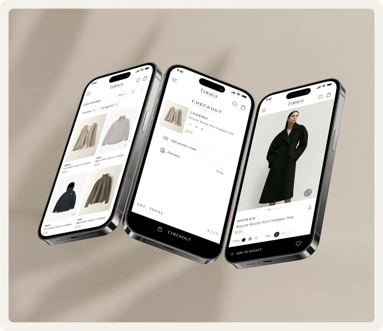
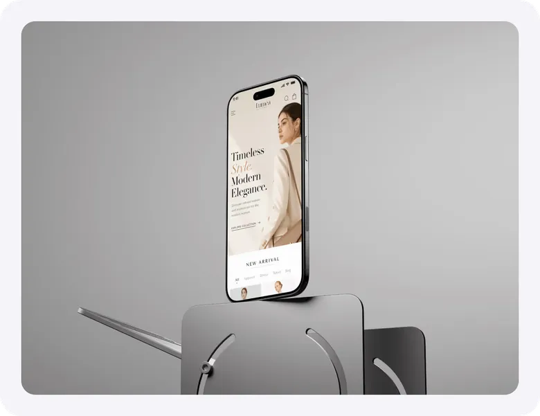
From home and curated collections to product detail and checkout, every screen designed in Figma with the same minimal, elegant system.
Key Flows
Browse. Discover. Checkout.
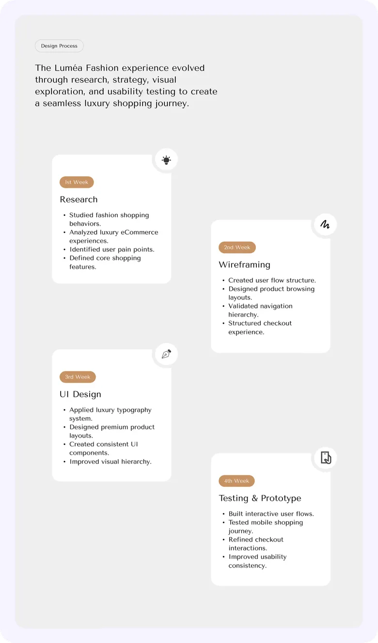
The core journeys mapped end to end (product discovery, collection browsing, detail views, and a checkout) designed to feel as smooth as the rest of the experience.
The Complete Flow
Every Screen, One System
Home / Explore
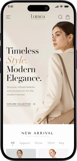
Elegant homepage crafted for discovering fashion collections, trending products, curated categories, and seasonal promotions effortlessly.
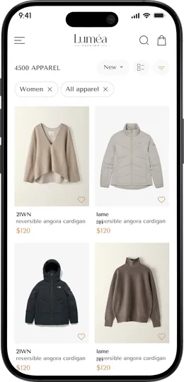
Product Listing
Clean product browsing experience crafted for discovering luxury collections, apparel categories, trending products, and seamless shopping exploration.
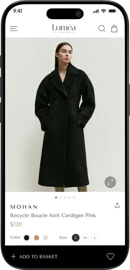
Product Detail
Immersive product detail experience designed for showcasing luxury fashion pieces through elegant imagery, size selection, color variants, and seamless purchase interactions.
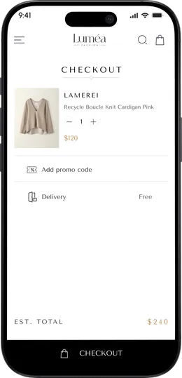
Checkout Flow
Simplified checkout experience designed for faster purchasing, seamless cart management, promo code handling, and effortless order completion.
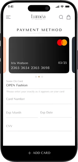
Payment Method
Secure and minimal payment experience designed for effortless card management, smooth transactions, and a seamless luxury checkout journey.
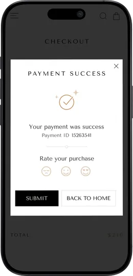
Payment Success
Elegant success confirmation experience designed to reassure users after checkout while maintaining a smooth and premium purchasing journey.
The Outcome
The Results
- Concept to production-ready design
- 3 Weeks
- Designed across the full app
- 81 Screens
- Design system consistency
- 100%
Got Questions
Frequently Asked Questions
How long does it take to design a SaaS website?
A basic website takes 1–2 weeks. A SaaS site that also needs a new brand identity and product screens takes longer; Signvex went from brand to launch-ready design in 4 weeks. We confirm your timeline after a free 30-minute strategy call.
Can TechNamah design the brand, product UI, and website together?
Yes. We design the brand identity, the product interface and the marketing website as one system, so typography, colour and components stay consistent everywhere. Signvex, Lead7 and NestAssure were all delivered this way, from the first logo sketch to a launch-ready website.
Why build a SaaS marketing site in Webflow?
Webflow gives a SaaS team a fast, responsive marketing site that the team can update without a developer, from new pages to pricing changes. We design the site in Figma and build it in Webflow, so the live site matches the approved design and stays easy to grow.